Epidemiology, Product
Table of contents
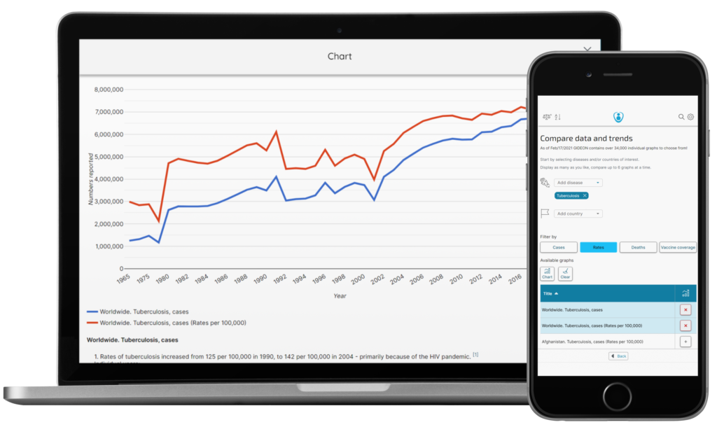
Epidemiologists, you can now get your data insights faster with the Quantify tool – one of the most cutting-edge additions to the comprehensive infectious disease database. Many people may not realize that an epidemiologist’s work is like that of a swan. Swans may glide smoothly on a lake, but their elegance is fueled by furious and relentless pedaling under the water. Similarly, readers can peruse infectious disease journals quickly with a simple online search. However, these publications are the culmination of years, and even decades, of extensive and meticulous data collection and analytics.
The Quantify module is a handy resource for busy epidemiologists in all research areas. It is applicable whether you study the epidemiology of emerging infectious diseases, disease surveillance in Africa, hepatitis C infections worldwide, the impact of lymphatic filariasis in Asia or pertussis vaccination efforts in France, and much more. It allows users to explore epidemic data, disease diagrams, disease frequency, and outbreak data.
Quantify Runs on The Popular GIDEON Epidemiology Database
With the Quantify module, you and your research teams can customize over 38,000 individual graphs on disease prevalence, prevalence rates, mortality, and vaccine coverage (when applicable). This means less time cleaning, organizing, and validating and more time for higher-level understanding.
Quantify draws from the robust GIDEON infectious disease database for deeper epidemiological insights. With 838,000+ data points across 235 countries and territories, the GIDEON database covers over 360 infectious diseases. All GIDEON charts feature a modern aesthetic that helps elevate the look and feel of your final submission. Additionally, since the database is updated daily, it is easy to refresh your data right before your presentation or paper submission.
How to Compare and Visualize Epidemiological Trends From Health Data Using GIDEON’s Quantify?
The Quantify module makes it easy for you to compare spatiotemporal datasets worldwide. For example, to demonstrate the measurable success of Wild Polio eradication efforts, you can generate a chart showing the decline in cases worldwide. Quantify can generate this for you in one step.
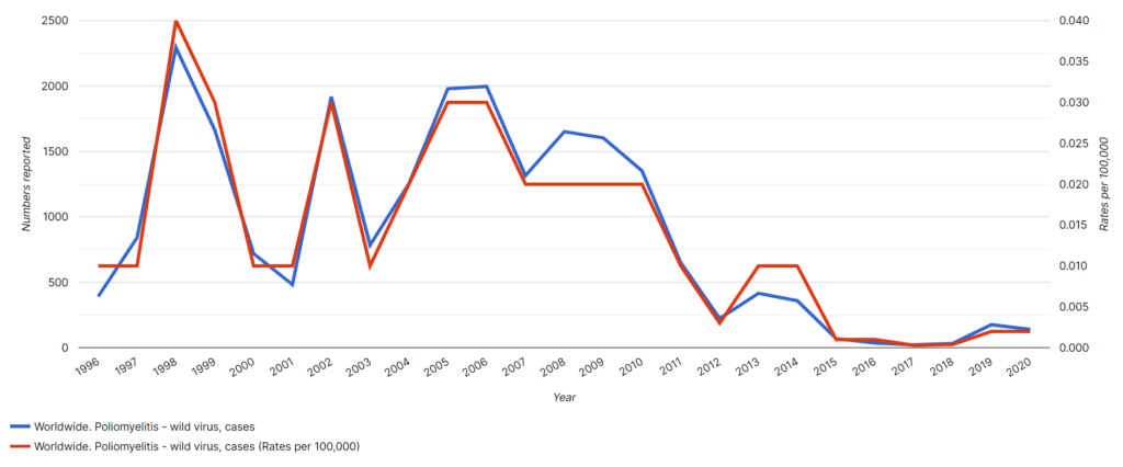
Image: Wild Poliomyelitis cases worldwide from 1996 to 2020.
As another example, what if you want a chart comparing Dengue deaths in India, Indonesia, and Malaysia?
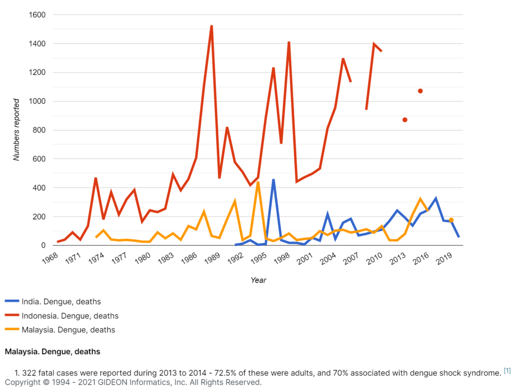
Image: Dengue deaths in India, Indonesia, and Malaysia.
Here’s how easy it is to create this custom epidemiological graph using Quantify:
Step 1: Select the disease
Step 2: Add the countries you wish to compare. You have the option to see worldwide data.
Step 3: Select the type of chart you need – prevalence, prevalence rates (per 100,000 population), deaths, or vaccine coverage.
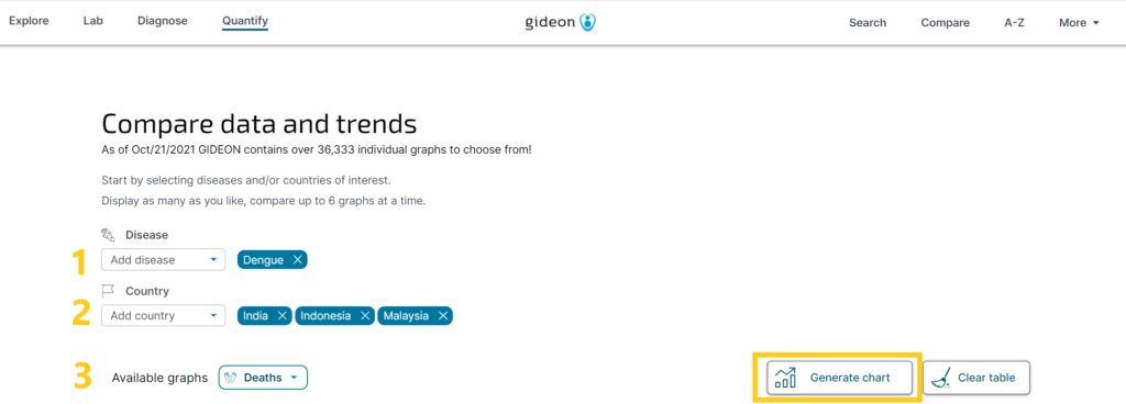
Image: 3 easy steps to create custom epidemiology charts using the Quantify tool.
Simplify Your Disease or Population Research with Quantify
Would you like to learn how GIDEON Informatics and the Quantify tool can help you optimize your epidemiology research?
Book a demo with us to get started! GIDEON is one of the most well-known and comprehensive global databases for infectious diseases. Data is refreshed daily, and the GIDEON API allows medical professionals and researchers access to a continuous stream of data. Whether your research involves quantifying data, learning about specific microbes, or testing out differential diagnosis tools– GIDEON has you covered with a program that has met standards for accessibility excellence. You can also review our eBooks on Lassa and Lujo Fevers, Legionellosis, Mansonelliasis, and more. Or check out our global status updates on countries like Guam, Kyrgyzstan, Libya, Mauritania, and more!